Brand Identity, Custom Iconography, Brand Guidelines, Brand Implementation, Presentation Design, Template Design, Apparel, Graphic Design, Ideation


Background
There are multiple stages in the fuel supply chain, including aviation refuelling, road tankers, mobile fuel trucks, bulk fuel terminals, storage facilities and industrial fuel systems. Liquip provide filtration systems, pumps, valves, vents, metering systems and other specialised components, supported by engineering design advice, servicing and system integration. Liquip represents more than 20 international manufacturing brands, supplying a wide range of specialist equipment to the New Zealand market to keep fuel systems safe, efficient and future-ready.
The Challenge
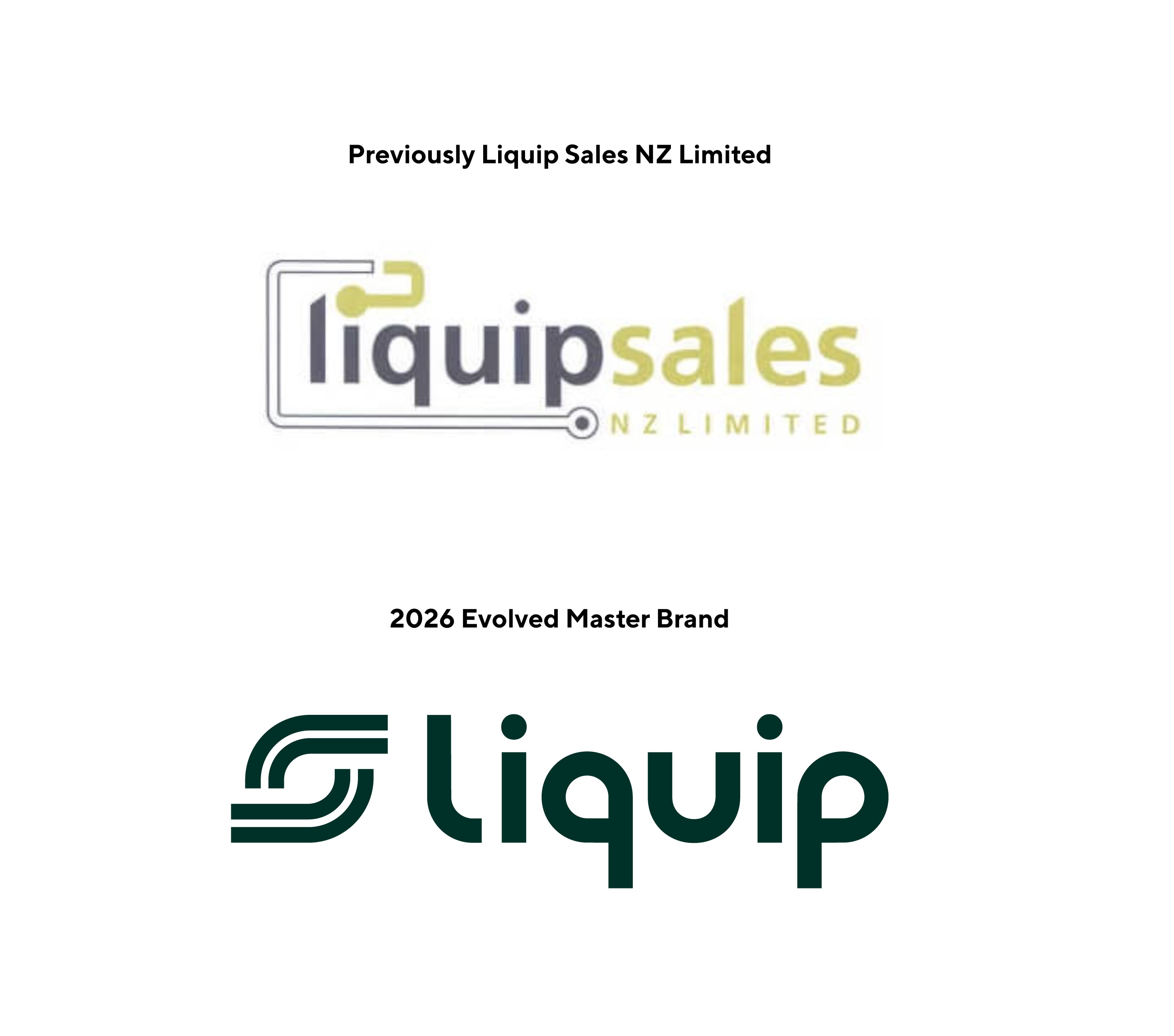
The brand had remained largely untouched since its inception and the possibility of brand stagnation was becoming a liability. A new generation of decision-makers is emerging, one that expect a visual identity reflecting technical sophistication and forward-thinking innovation.
The challenge was clear: modernise the brand without alienating the loyal customer base to retained the brand equity and trust associated with the Liquip name while presenting the business in a more contemporary and commercially fit way.

The Approach
When approaching the evolution of the Liquip brand it was not done in isolation, it was a collaborative process. We made the process as inclusive as possible through open conversations and a genuine understanding of the vision forward. We didn't just refresh the brand, we evolved it in a way that honoured its roots, vision and strategic goals for the future.
A considered modernisation. This included:
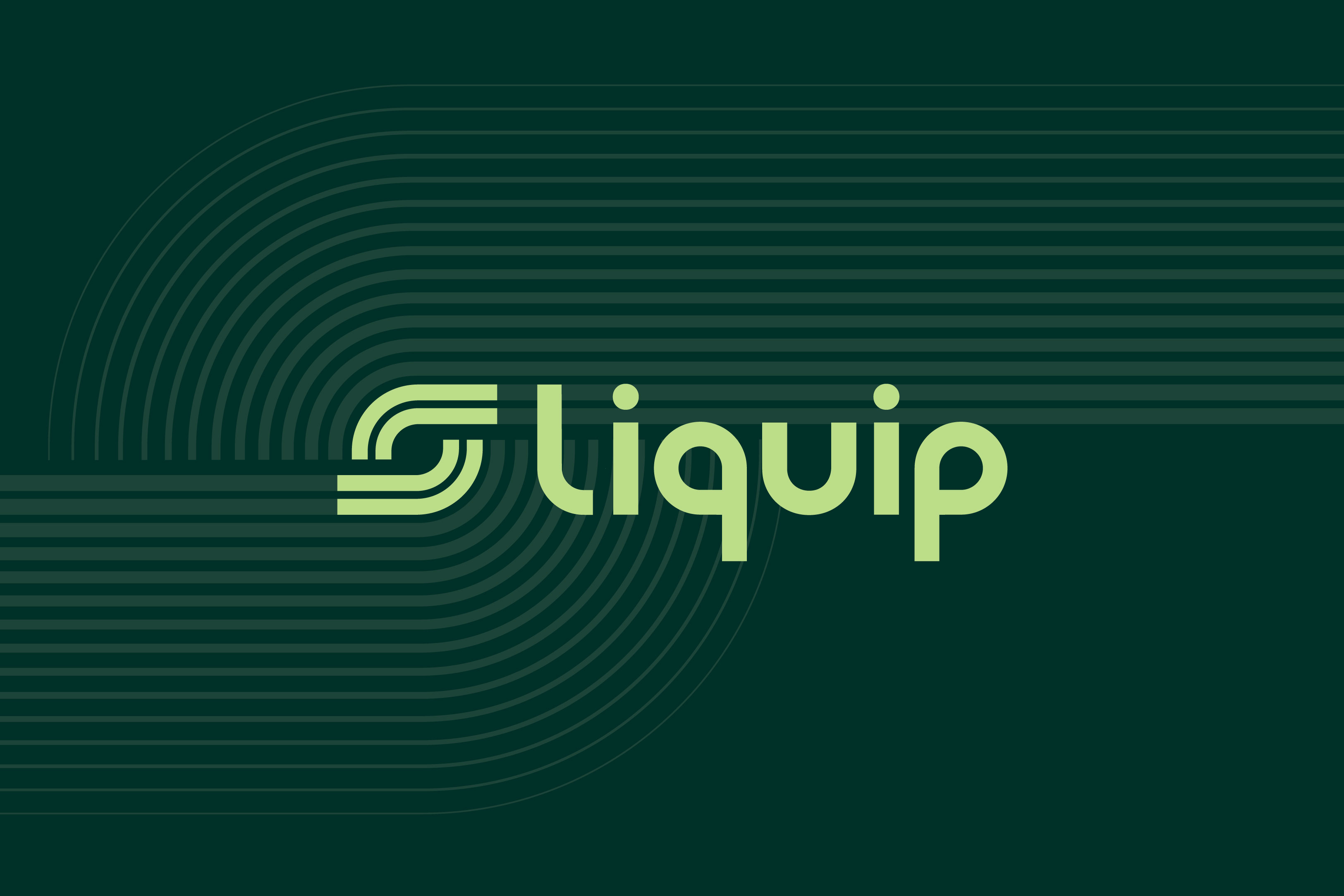
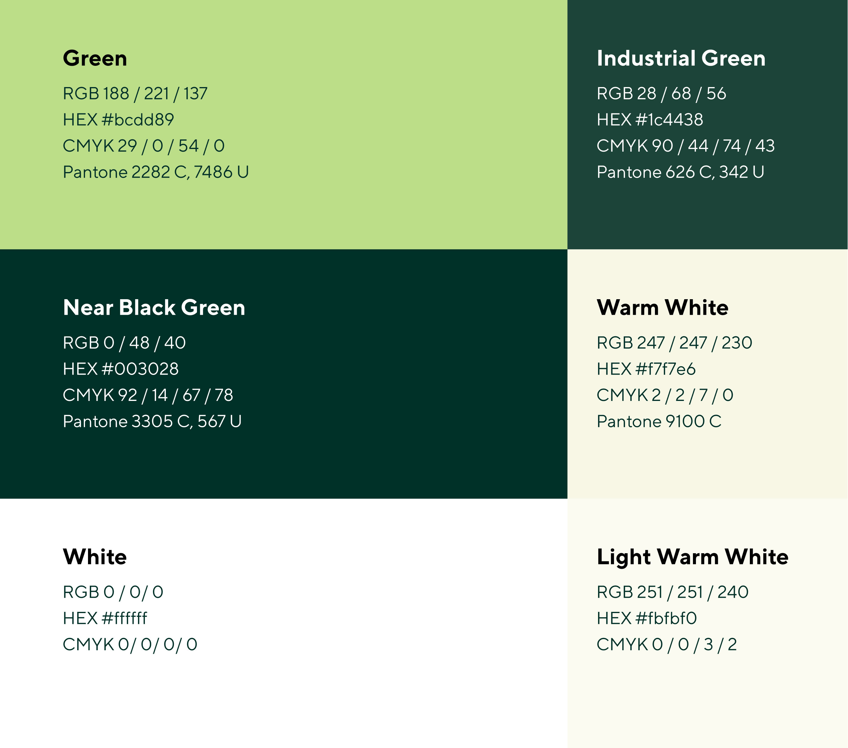
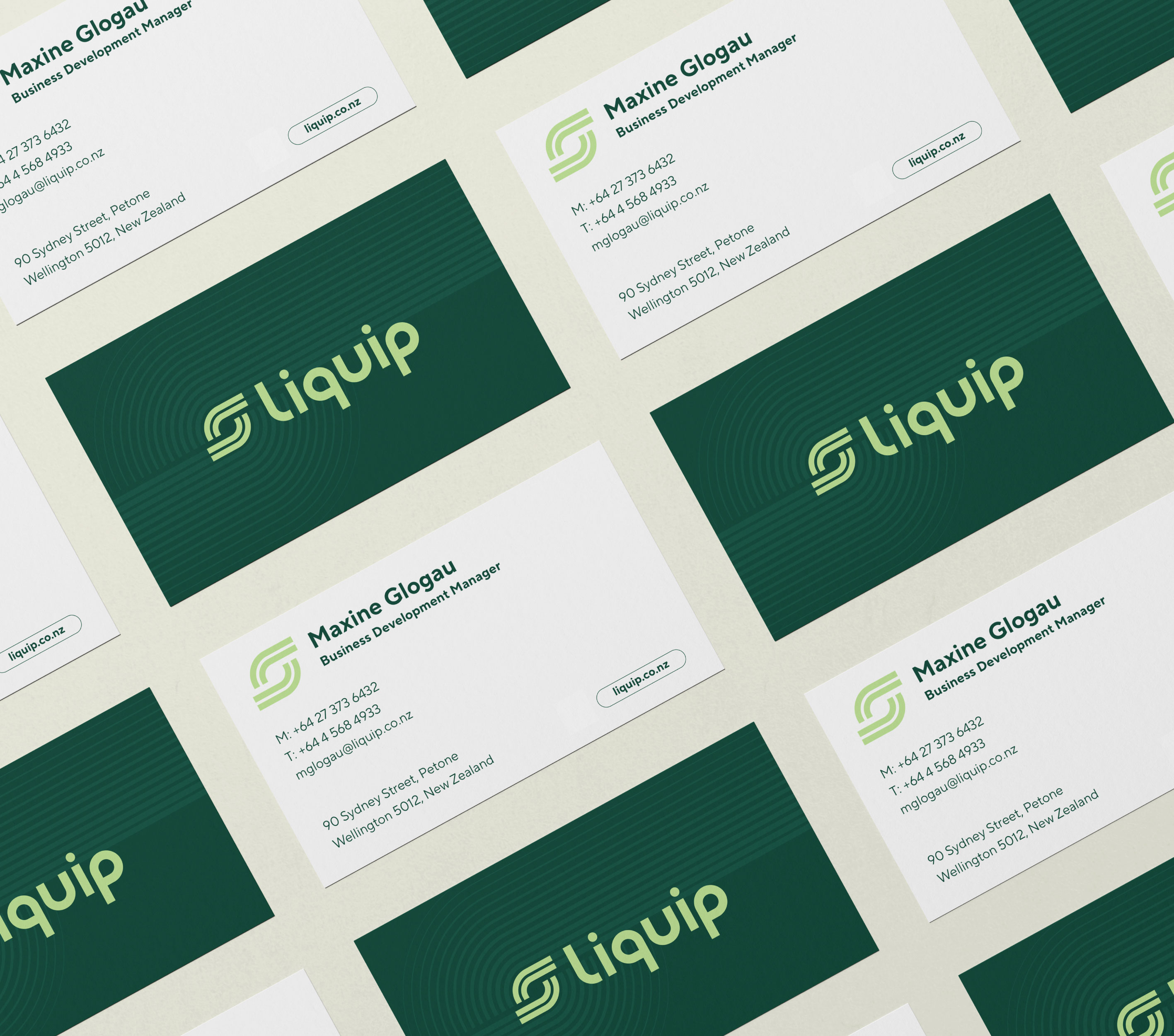
The new logo is built from two core elements: the custom wordmark and the graphic device that accompanies it. The graphic device itself is conceptually layered, drawing from ideas of exchange, flow and connection while also incorporating the ‘L’ from the wordmark as a structural anchor. At its centre, a circular motion echoes the abstract liquid droplet forms found within the wordmark's lettering, creating a visual through-line between the two elements.
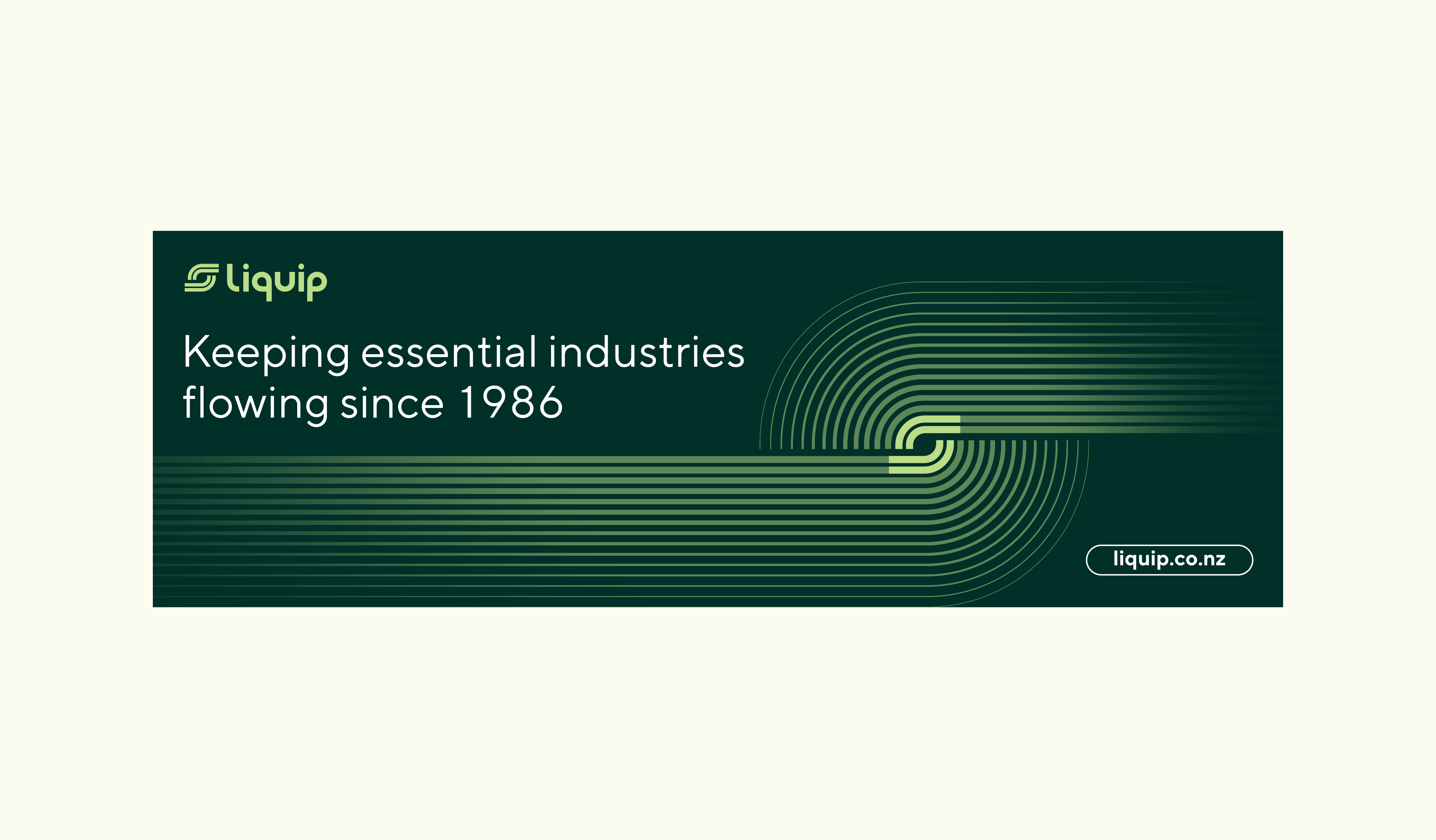
From this device, a supporting pattern emerges. One that carries the same sense of movement and motion throughout the wider visual system, reinforcing consistency across every application.


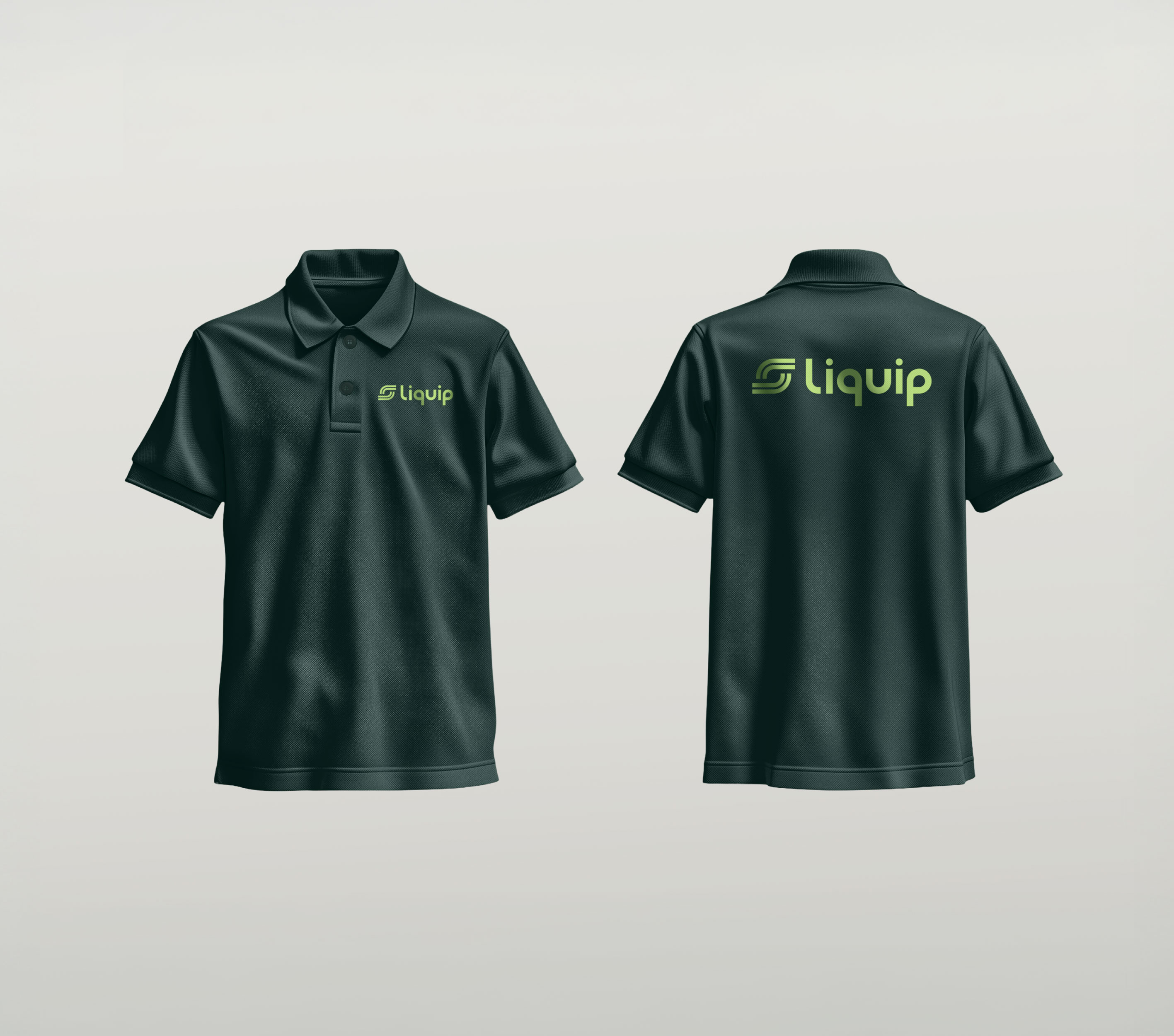
We created an interactive brand guide that shows the team how the brand speaks, responds and behaves. A brand only works when its verbal, visual and behavioural decisions work as one system. That’s how nothing gets lost in translation and the brand stays recognisable and trusted.

The result
A brand that retains the equity and trust built over years of customer relationships while presenting a more contemporary, commercially relevant face to the market.
It preserves the connection with the existing, loyal customer network but critically, it now speaks fluently to a new generation of decision-makers.
More than a visual refresh, the new identity is a strategic alignment: it reflects the business's technical depth, leadership position and innovative methods, positioning the brand to connect meaningfully today and align and scale into the future with its business goals moving forward.
The result
A brand that retains the equity and trust built over years of customer relationships while presenting a more contemporary, commercially relevant face to the market.
It preserves the connection with the existing, loyal customer network but critically, it now speaks fluently to a new generation of decision-makers.
More than a visual refresh, the new identity is a strategic alignment: it reflects the business's technical depth, leadership position and innovative methods, positioning the brand to connect meaningfully today and align and scale into the future with its business goals moving forward.