Brand Identity, Illustration, Packaging Design
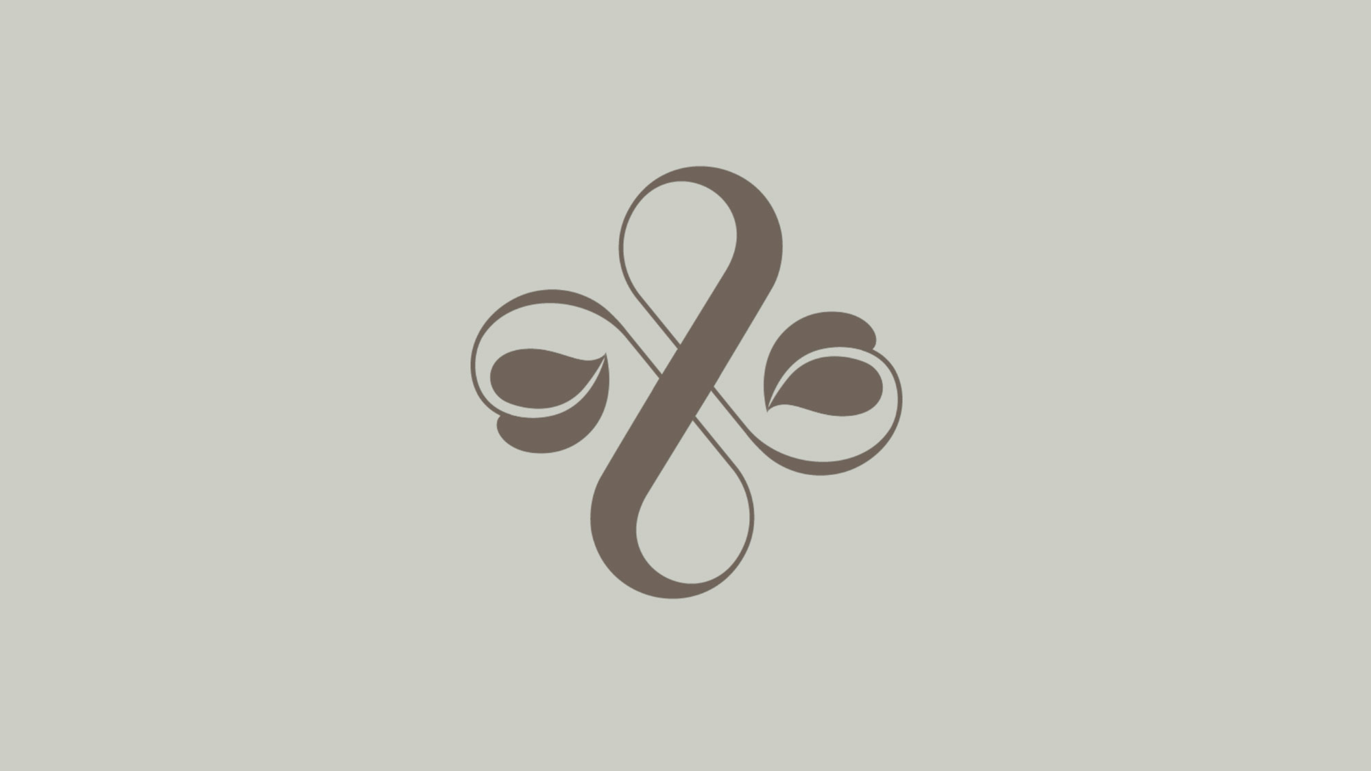
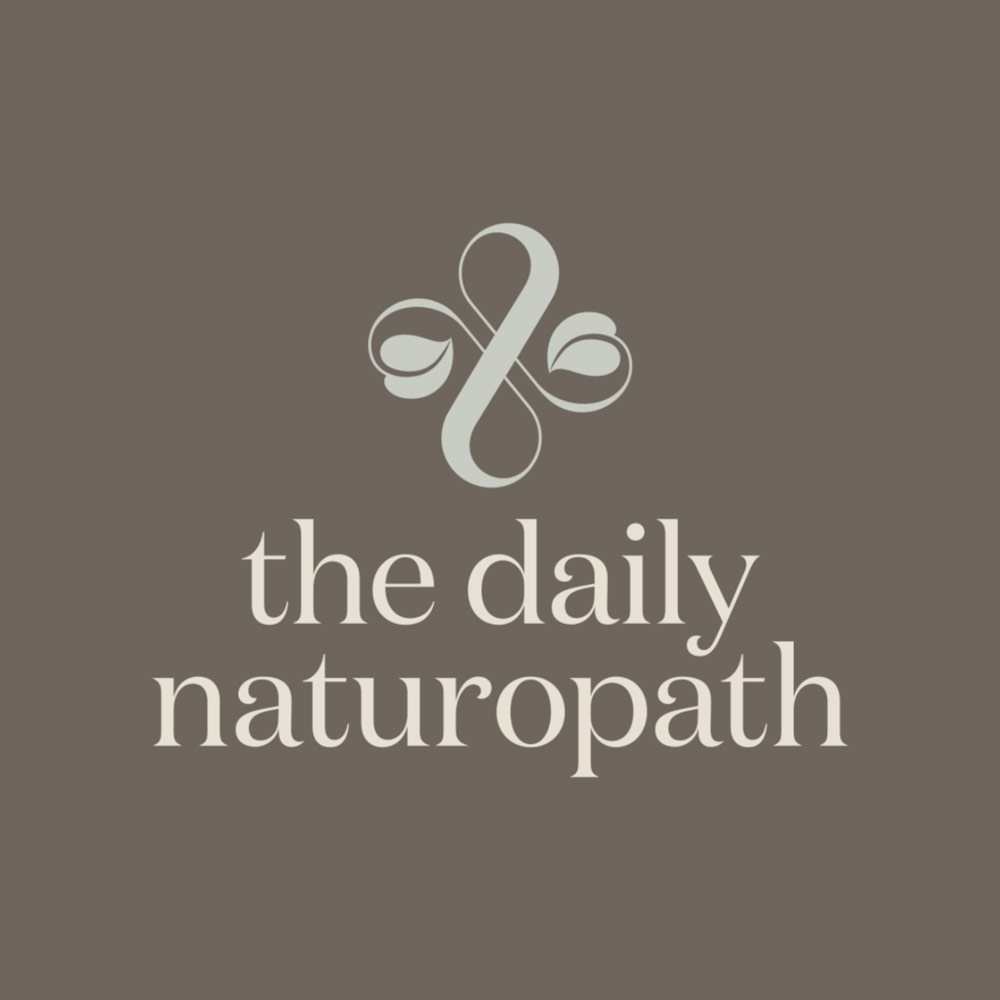
The Daily Naturopath sought to evolve its brand identity beyond a simple standalone wordmark, introducing a distinctive graphic device to strengthen recognition in an increasingly competitive market.
The master logo is designed to feel informative and balanced, grounded in calm and inspired by nature. It reflects the interconnected relationship between self, nutrition, the natural world and herbal medicine while also expressing the creativity and innovation driving future product development.
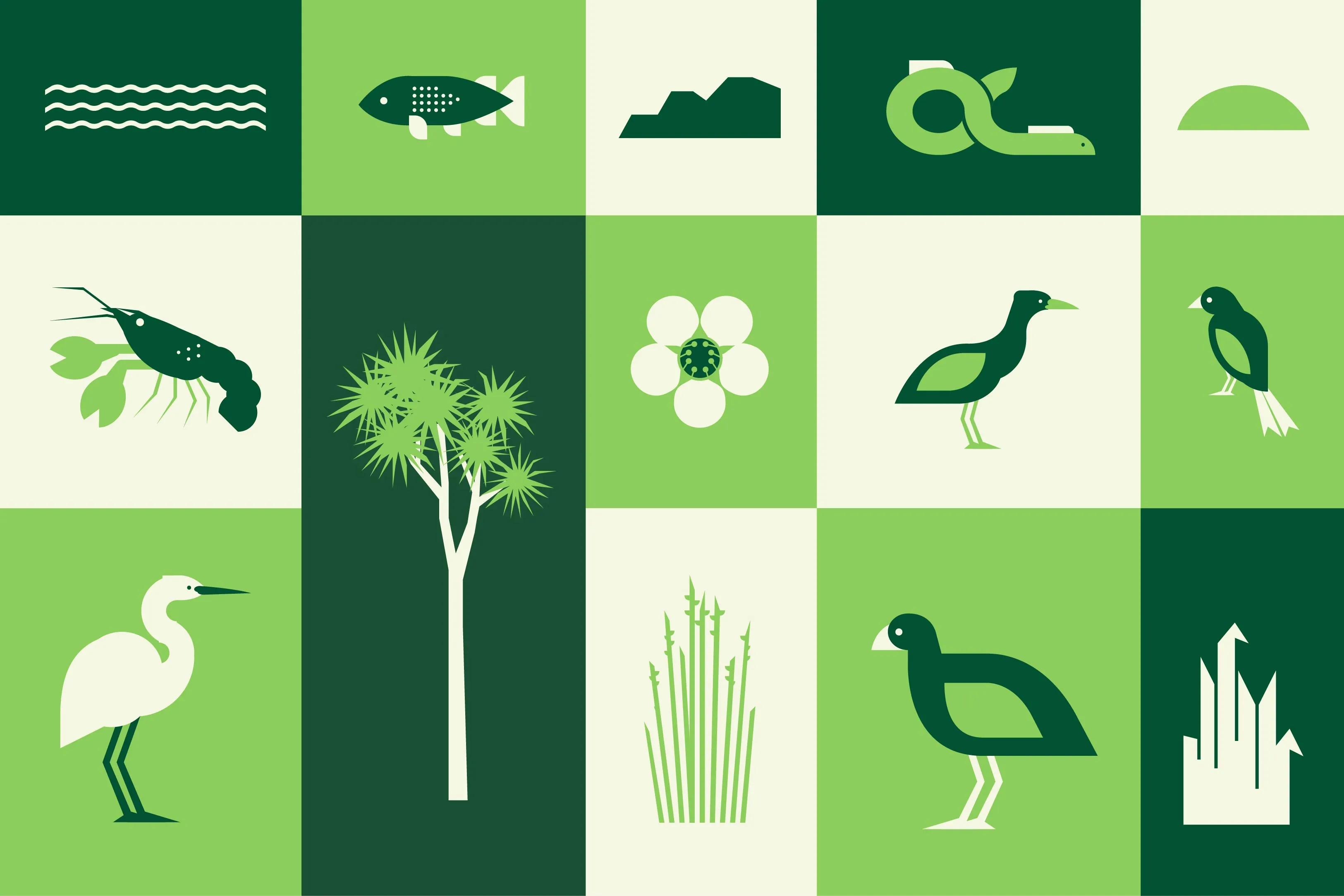
A key challenge was capturing a sense of organic movement that feels both calming and inviting. This is achieved through a custom hand-drawn graphic style that conveys natural vitality, balanced with a refined, modern aesthetic.
The typography was also redefined: a curvaceous, elegant serif introduces a contemporary yet expressive aesthetic that echoes the fluid forms of the graphic device. This is paired with a clean sans serif font inspired by contemporary Japanese design that is crisp and minimal, yet slightly unexpected in its detailing with generous openness and refined typographic features. Together, these type choices reflect how naturopathy honours time-tested practices while continuing to evolve for modern life, balancing tradition with clarity and modernity.
At the heart of the logo are four abstract circles, symbolising the pillars of holistic wellbeing: physical, mental, social/emotional, and spiritual health. These forms also reference core areas of The Daily Naturopath’s offering: massage therapy, movement, nutrition and herbal remedies. Together, they express continuity, wholeness, and connection, reinforcing balance as the foundation of both naturopathy and quality of life.
Fluid movement flows within and around these shapes, representing both physical practices such as yoga, pilates and massage, and the internal flow of energy associated with essential oils, herbal medicine, tonics and skincare. This gentle rhythm creates a sense of harmony within the body. On a deeper level, the design subtly references yin and yang, central to Traditional Chinese Medicine, symbolising balance achieved through lifestyle, nutrition and herbal practices.
Surrounding circular elements echo the form of a kawakawa leaf, honouring nature as a guiding influence and grounding the identity in its botanical roots.
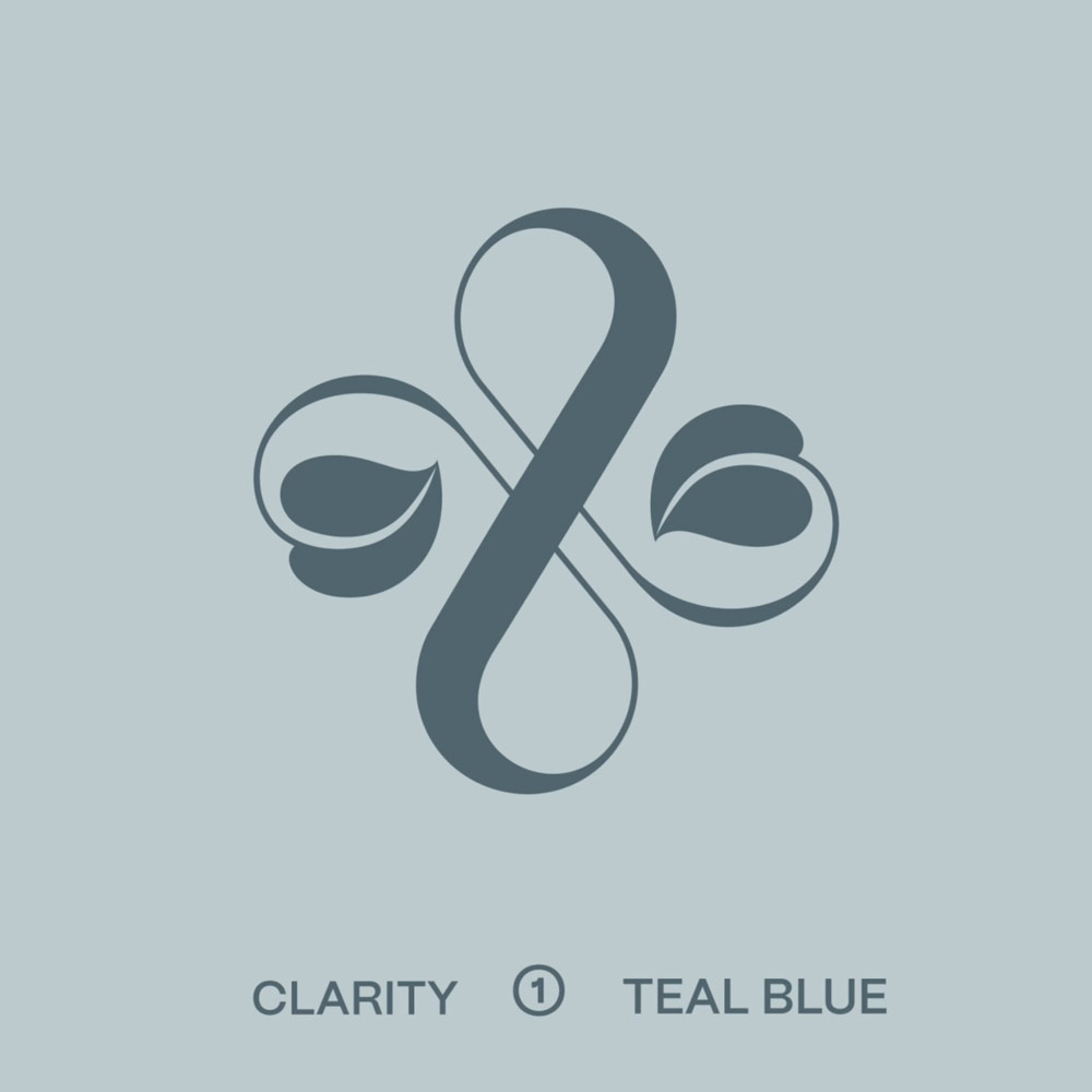
The colour palette evolved into a soft, natural range of muted tones that feel calm, organic, and elevated. Earthy greens, deeper browns and warm off-whites create a grounded, nature-inspired foundation. A secondary palette extends this system, designed for application across product ranges such as skincare and packaging, enhancing sensory engagement. Deeper tones bring richness and stability, while the lighter muted hues add dimension without overwhelming the composition. To maintain visual hierarchy and cohesion, lighter tones are consistently anchored by deeper shades ensuring flexibility across applications while preserving the integrity of the brand.
Full case study coming soon.